Dorothy Fratt (1923–2017) studied, taught, and began showing her paintings in Washington, DC, where she was born. Some of her earliest works, executed in a Cubist style during the 1940s, foretell her lifelong preference for strong, unadulterated hues. Yet she missed her birth city’s heyday as a center for Color Field painting, as she relocated to Arizona in 1958 and remained there for the rest of her life. An artistic homecoming of sorts, this expertly selected and flawlessly installed exhibition was, incredibly, the first solo presentation of her art in the area since 1948. Thirty-some paintings, drawings, and prints, predominantly from the 1970s throughout the early 2000s, convincingly established her as a compelling fellow traveler of the Washington Color School. No less important, however, they showed just how distinctively she stands apart.
At the center of the exhibition, a single wall displayed a showstopping group of sixteen compositions, most of which were executed on paper, or on paper mounted to canvas. Encompassing figuration and abstraction, the selection included ink drawings, watercolors, and serigraphs alongside acrylic paintings. The sampling suggested that paper was not merely one type of support among others but rather that it fundamentally grounded the artist’s sensibilities across various media.
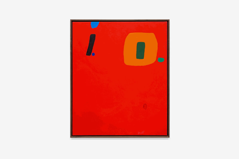
The largest painting in this show, David’s Lyre, 2001, measured fifty-two by forty-six-inches; many others were considerably smaller. Eschewing the link between visually expansive color effects and dramatically increased dimensions—characteristics now seen as broadly emblematic of Color Field abstraction (think Morris Louis’s enveloping veils or Kenneth Noland’s giant concentric circles)—Fratt keeps her edges firmly in view. Indeed, she consistently underscores them by placing small, invitingly tactile tabs, patches, and strokes of paint in attention-grabbing hues—bright lilac, cerulean, and mint or kelly green—right at the compositions’ limits. Elsewhere was Code Talkers, 1986, the lone example here of the type of work featuring separately joined, individually stretched canvases within a single frame. In this piece are two rectangular units, differently sized and assembled in a manner that recalls the intuitive, additive process of collage. (Collage #3, 1980, could almost be a maquette for a multipanel painting in this vein.)
Two other seemingly opposed aspects of Fratt’s style also appear grounded in the intimacy and immediacy enabled by paper supports. At one pole, we find gestural, hand-wrist notations that frequently suggests letters or punctuation marks, as in a number of untitled paintings on paper and canvas. Yet this approach can also yield simple back-and-forth scribbles, as in Monsoon, 1985. Within the picture’s landscape-like compositional logic (it has been cited as evidence of the influence of Arizona’s desert vistas on Fratt’s abstraction), a zigzagging mark might register as a peculiarly emphatic cloud. Yet it equally suggests a test doodle with an overlarge crayon or oilstick, effectively returning us to the spaces and automatisms of the page. At the other pole is Fratt’s penchant for gestures and forms rendered in values so close to those of the surrounding field that they become utterly illegible in reproduction. Take the gray-black shape on the left in Bikutsi Blues, 1987, that at first glance is all but indistinguishable from the dark-blue band in which it appears embedded; or the barely perceptible orange bar nestled in the brilliant vermilion expanse of Hopscotch, 2001. Where the more contrastive, quasi-graphic marking delivers itself quickly, these infinitesimally calibrated effects make themselves known slowly, requiring us to get up close and personal with the pictures.
In many cases, Fratt combines these modes, as is evident in two other instances that deploy versions of that orange-against-vermilion pairing: the flowing, M-like form of an untitled 2001 painting on paper mounted on canvas, and the broad U-shaped trace occupying the lower half of perhaps my favorite painting in the show, I Owe You, 1997. There, positioned beneath a bold blue-dotted black i in the work’s upper-left section situated next to a green-centered marigold O in the upper right, is that curving form that completes the familiar phonetic acronym. Look again, and it’s the grin on a winking face. Take a picture with your phone, however, and it’s likely gone. The acknowledgment hinges on your presence.
